Exciting Updates: Enhanced Patron Benefits and Dev. Build for All Patrons on June 31!
Great news! Starting in June, I've upgraded all tiers to give you more opportunities to participate in the game's development. What do you think of it? Let me know!
Here are the changes:
- Level One patrons will now receive a link to test the game every four months, allowing you to experience the progress at regular intervals.
- I've also upgraded the benefits for Level Two patrons (advanced and enthusiast)! You'll receive a new link every two months, ensuring you're more involved in shaping the game's direction than ever!
- Level Three Contributors will continue to receive monthly links, granting you the most substantial influence of all tiers on the game's development through your feedback before every other tier.
To streamline the distribution of links, I've implemented a fixed schedule that begins in July. This schedule is to help me track rewards and to make it more attractive for new patrons to get involved: New pledgers in July will receive a download link along with all the long-time patrons. This is the best moment to join and get involved! Newcomers will only have another opportunity like this to join and receive a copy right away in September, but only for Level Two memberships!
Here's the revised schedule:
- July 31: Links available for all tiers, including new patrons from any tier.
- August 28: Exclusive link access for Level 3 patrons only.
- September 25: Links available for Levels 2 and 3 and for all Level 2 newcomers.
- October 30: Exclusive link access for Level 3 patrons only.
- November 27: Links available for all tiers.
- December 25: Exclusive link access for Level 3 patrons only.
I hope you liked this timeline along with the improved benefits. Your support and involvement mean the world to me, and I can't wait to share the game's progress with all of you!
-----
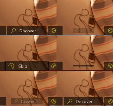
In other news, I had some engaging exchanges with the testers last month, inspiring me to try new things on the interface. The one I'm showing below is the most promising until now: I've made a button that flips and unlocks more options when the game changes its state from Cutscene mode to Exploration mode. It's the Discover Button.

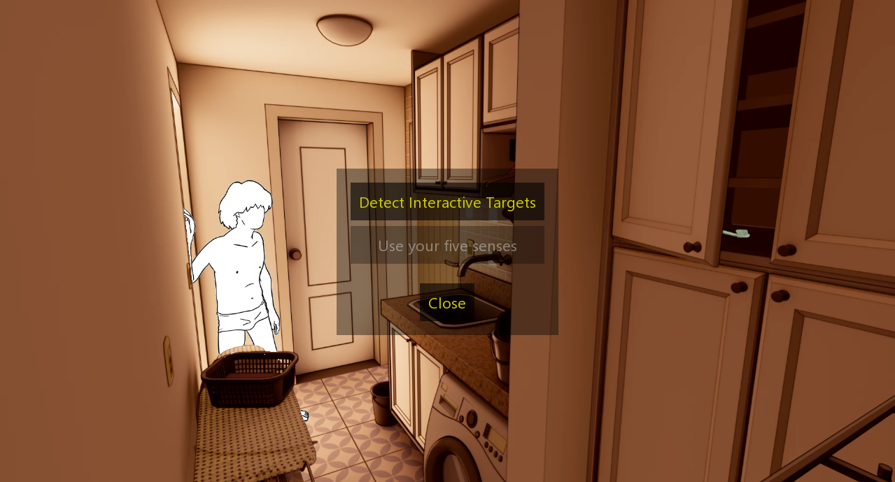
This button shows a menu with different ways to interact with the game's environment, like so:


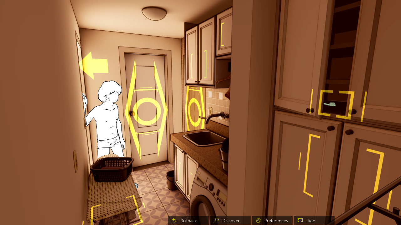
It only has one option now, showing every interactable object in the background. It will assist you very well in navigating Martin's house.
This other button, temporarily named 'use your five senses' will make Martin smell, hear, see, touch, and taste his environment to enhance the player's immersion in the game and unlock more cutscenes and places to explore (I left this button disabled right now because I haven't fully figured it's interface yet, but I'm thinking about it already).
In the future, this Discover menu will also include a screen that will show Martin's thoughts based on the game's current state to help the player figure out better what to do next and what Martin already experienced during that specific playthrough.
You might wonder why I didn't opt for the traditional shine on clickable objects by hovering the mouse on the screen. The reason is simple: I want this game to look and feel the same on smartphones and PCs. Unfortunately, smartphones lack the mouse hover feature, and simulating it by dragging the screen can be cumbersome within the Ren'Py engine, so I'm embracing this design limitation to try new things.
That's all I have for this week!
Remember: all patrons will receive a link to test this feature on July 31!
Your feedback and thoughts will help shape the design and feel of The Martin Experiment.
If you want to get involved, this is the best moment to join and test the game!
The next best time to enter will be September but only for Level Two memberships!
Get The Martin Experiment - Teaser Version
The Martin Experiment - Teaser Version
Psychologically rich erotic visual novel
| Status | Released |
| Author | Distrac-Fu |
| Genre | Visual Novel |
| Tags | Adult, Comedy, Eroge, Erotic, Male protagonist, Meaningful Choices, Mental Health, Multiple Endings |
| Languages | English, Portuguese (Brazil) |
More posts
- July Dev Build is here!Aug 01, 2023
- June build uploaded!Jun 27, 2023
- The Martin Experiment Survey Results Part 2!Jun 24, 2023
- He's back! Our talented artist is back!Jun 09, 2023
- The Martin Experiment Survey: partial survey results are in!May 30, 2023
- We want to hear from you - Fill out our survey today!May 13, 2023
- Happy New Year!Jan 01, 2022
- Now, we are on Twitter and Instagram!Sep 14, 2021
- Web Version ready!Jul 22, 2021

Leave a comment
Log in with itch.io to leave a comment.